5 Tips On How To Design A Winning Logo – The 5th Tip Will Shock You!

Over the past 16 years, guess how many business cards and marketing collateral we have printed & produced for new start-up companies?
We know a winning brand (logo) when we see one.
A winning logo is never subjective but rather it needs to be objective.
You need your target audience to see your vision and know the story behind YOUR logo!
When you browse the web for information on “how to design a logo”, you might see pages of tips given by CEOs, Directors, Presidents of companies on how to design your logo…
BUT HONESTLY? Do you really think these people actually designed the logo for the company? HELL NO! They hire a professional branding company like us to do this crucial task! They simply fill us in on their vision, their products & services, and at most, their preferred logo themes and corporate colours and we do the rest of the work.
So, as a new start-up with limited funds to spend on marketing, how do you create an eye-catching logo?
Here’s how you can accomplish it on your own.
Do you remember how often you doubted and suppressed your creativity juice just because you assumed your lack of knowledge in this area? In actual fact, you probably possess this ability all this while!
Regardless of what type of business you are building, Creativity In Branding Is the KEY!
You need to know this :
- You need the Colours, Typography and Design to send a strong message and spark your customers’ interest at the very first glance.
- Within the first 1.5 seconds of setting eyes on your logo and name card, they must be able to correctly guess the product and services that you are promoting.
Conceptualization :
- You have the freedom to express creativity in building your own brand. Remember, you are marking your brand as unique and want it to stand out from your competitors. How do I know this? Because, when you unleash your creativity, you’re being you—and no one else can do that.
- Understanding your targeted audience behaviour and their age group is important.
- For Example: “You sell golf accessories, your primary colour will most likely be GREEN and never brown, why? All golfers want to see their golf balls to be on the green instead of the bunker ( brown sandpit) right? Green and Blue will pairs perfectly simply because all golfers wish to enjoy their favourite sport on the lush green under a clear blue sky.
So, choose the corporate colours for your logo wisely.
Our personal advice “FOCUS ON SUBSTANCE & Less On Style”
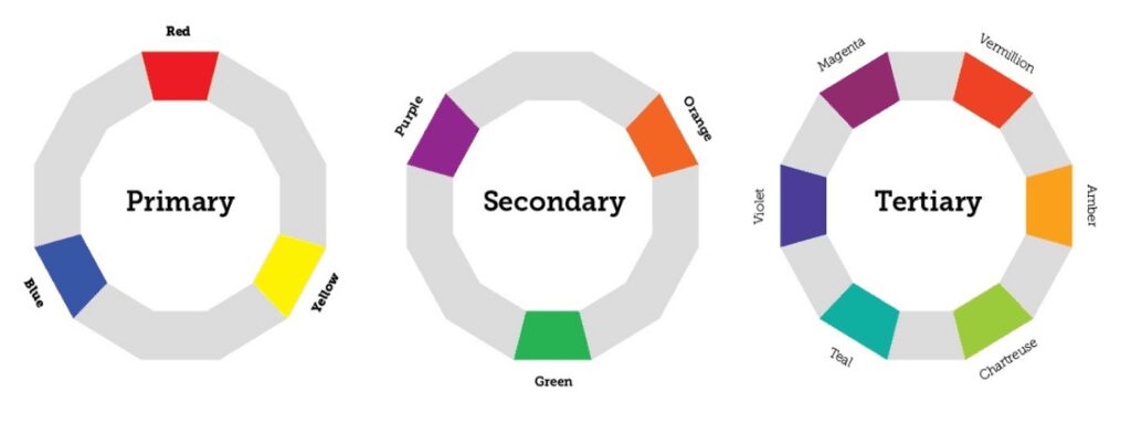
Use this colour wheel while you’re at it, IT DEFINITELY HELPS!
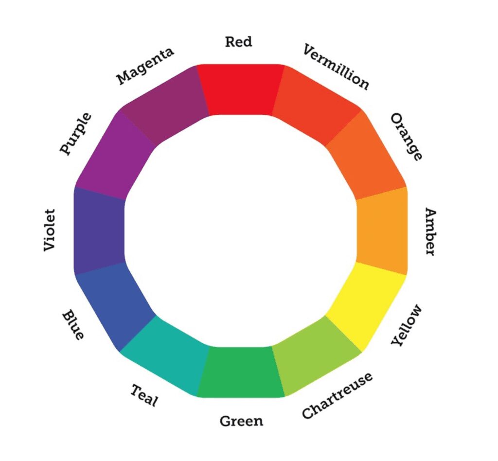
We are confident that you know what are the primary colours (red, yellow, and blue) and how to mix them to form the secondary colours (orange, green, and purple).
And the secondary colours are mixed to form the tertiary colours (vermillion, amber, chartreuse, teal, violet, and magenta), rounding out of the colour wheel.
Now, how are we going to use this colour wheel to create impactful colour palettes? Let’s start by reviewing the classic colour relationships.
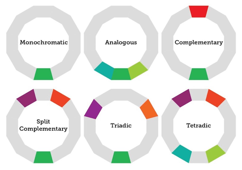
- Monochromatic: A monochromatic colour scheme consists of a single colour (or multiple variants of that colour).
- Analogous: Analogous colours are side-by-side on the colour wheel.
- Complementary: Complementary colours are across from each other on the colour wheel.
- Split-complementary: A split-complementary colour scheme is a variant of the complementary colour scheme, with one base colour and two secondary colours adjacent to its complementary colour.
- Triadic: A triadic colour scheme features three equidistant colours.
- Tetradic: A tetradic colour scheme features two pairs of complementary colours.
Achieving Effective Communication Using The Power Of Colours
Branding & Design Companies use all sorts of tricks to visually enhance communication. When it comes to communication, colour is one of the most powerful tools in the designer’s toolkit.
Colour is especially useful for:
- Creating Contrast
- Grouping Elements
- Encoding Quantity
Use colour contrast to make your most relevant content visually salient
Salience is a quality that makes an object stand out against its surroundings. Like a loud phone ringing in a quiet room or the flash of some (terrifying) creature’s eyes on a dark evening, salient objects or events immediately grab our attention.
We can learn to control salience in our infographics to help our viewers pay attention to the most important elements of a composition. By playing with attributes like colour, shape, size, position, and orientation we can create the contrast that our brain is hardwired to pay attention to.
Here Are The 5 Major Tips For A Winning Logo
- Avoid The Latest Logo Trend Cliché
- Should you follow them, letter to letter? ABSOLUTELY NOT!
- Customize Your Very Own Logo
- Custom Logotypes helps to ensure that your unique logo will stand out and be remembered.
- Tons of lowlife designers will rip off your work in a heartbeat if they discover what style and typeface you’re using, but it takes some real skill to mimic custom hand-drawn type!
- Often, a designer will simply take a trip to the Font Menu have it in different colours and there’s your logo, so be careful.
- Understand Your Logo And Know What It Means
- Every winning logo has its own story behind, for example, FedEx logo’s arrow indicates moving forward and making deliveries, the Apple logo has a “byte” missing, and the Twitter bird is flying in an upward trajectory.
- Keep It Simple Stupid
- Not everyone is a “Picasso” or a digital artist who can burst out gorgeous, hand-drawn or computerise 3D logo.
- Simple but powerful logos can make a statement to the business world and have proven to be easily recognizable and memorable ones. (Apple, Nike, McDonald’s)
- Consider Passive & Animated Logo
- By now you should probably be familiar with the importance of designing a proper company logo. One of the most important functions of a logo is to create and promote brand awareness.
- It is a digital world now and this is one of the main reasons why companies choose to invest in an animated logo. Animated logos are both more memorable and even more recognizable to consumers than static logos.